Where's my Dive List?
15/04/15 12:40 Filed in: Dive Log Manager | DiveLogDT
Using Dive Log Manager/DiveLogDT, the most used panel is usually the “Dives” panel. This is where your main list of dives is in the bottom portion of the window, and the details about the currently selected dive is in the top portion. In the top portion, one of 5 tabs showing a summary or some portion of the dive will be selected.

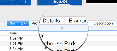
You can change how much of the window should show the dives list and how much should show the dive information. See that little “dimple” underneath the word “Details” in the tab list? If you put your mouse overtop of that, your cursor will change into the “resizing” cursor. You can now click and hold and move that tab bar up, making more room for the list, or you can move it down, making more room for the information.
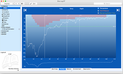
Turns out you can move it ALL the way down so that there is no list showing anymore, only the tabs and the dive information. You might not want to do this for some of the tabs, but if you’re looking at your dive profiles for example, it removes some of the distraction and makes a nice view shown here.

One of the things MacOS can do automatically, is remember how you had your windows within an application configured so that it can put them back exactly the same way the next time you run the app. It’s a nice touch. But guess what, MacOS has some bugs. One we see fairly often is that sometimes when you start up Dive Log Manager/DiveLogDT, it will configure the windows so that the “dimple” is all the way at the bottom and the dives list is no longer showing! Even though you didn’t actually leave it that way last time. Go figure!
Easy fix of course - just grab the dimple at the bottom and drag the tab bar back up to where you want it to be. But, if you don’t know you can do that, it can certainly be confusing.
So, now you know.
One other option is to add a "feature" in the application so that you always have to have at least 1 dive in the list area showing. Let us know if you think that's a good idea.

You can change how much of the window should show the dives list and how much should show the dive information. See that little “dimple” underneath the word “Details” in the tab list? If you put your mouse overtop of that, your cursor will change into the “resizing” cursor. You can now click and hold and move that tab bar up, making more room for the list, or you can move it down, making more room for the information.
Turns out you can move it ALL the way down so that there is no list showing anymore, only the tabs and the dive information. You might not want to do this for some of the tabs, but if you’re looking at your dive profiles for example, it removes some of the distraction and makes a nice view shown here.

One of the things MacOS can do automatically, is remember how you had your windows within an application configured so that it can put them back exactly the same way the next time you run the app. It’s a nice touch. But guess what, MacOS has some bugs. One we see fairly often is that sometimes when you start up Dive Log Manager/DiveLogDT, it will configure the windows so that the “dimple” is all the way at the bottom and the dives list is no longer showing! Even though you didn’t actually leave it that way last time. Go figure!
Easy fix of course - just grab the dimple at the bottom and drag the tab bar back up to where you want it to be. But, if you don’t know you can do that, it can certainly be confusing.
So, now you know.
One other option is to add a "feature" in the application so that you always have to have at least 1 dive in the list area showing. Let us know if you think that's a good idea.